

As mythology tells us the story of Pandora who opened the box to all the evils in the world, it also tells us that at the very end, it was Pandora who unleashed all the HOPE in the world as well. Pandora jewelry captures the essence of this story to weave into it’s own brand story.Travelling all the way from Copenhagen,Denmark to becoming a leading global jewelry brand, close behind Cartier and Tiffany, Pandora is famous for all of its customized charm bracelets and jewelry.
When I think of the brand, a sense of mysticism takes over, a curiosity to know more, to explore the occult world of charms. And this is exactly what Pandora capitalizes on in its UX.
Clean. Navigable. Engaging. The web page opens to a variety of options for the user, with ‘BUY NOW’ not hovering in front of your eyes all the time. Each platform effectively serves its purpose of intriguing the user to explore the different charms and their significance, ultimately compelling them to purchase one themselves.
The perfect UX is a perfect combination of technology, feelings, and content.
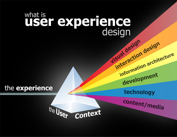 Pandora leverages technology with visually appealing design and site architecture. It also has an entire section to design and create your own customized charm. This is an important touch point of customer engagement. As far as content is concerned, the brand has really done a brilliant job of presenting it to the user. You have charms and their meaning ready to be be explored, just exactly what the brand stands for. There are also guides to creating trendy looks accompanying the jewelry. There are videos and pictures from all over the world. Pandora magazine is a delight for readers with various news feed and articles. There are stories of their own customers with beautiful moments captured through pictures, forever engraved on the brand site now. Trend reports updating users on the latest fashion content are a favorite among fashionistas. The brand aptly uses visual and content appeal to form a connection with the user.
Another very clever tactic employed by Pandora to improve user experience is allowing users to create and share their wish lists, save sizes, and for which subtly urging them to join the Pandora Club, enlisting all the benefits of membership in a way that one cannot resist to register. I say this is clever, as not only does it improve UX, but also increases their subscribers and followers, giving them a digital advantage. There is a clear call to action at every point on each platform, whether to subscribe, connect, follow. or purchase.
Pandora has also done well in studying its target demographic and their lifestyle, which is why it allows members to download free songs from the website, something very unrelated to the brand itself, but proving the user centered appeal of the brand.
The brand across all platforms, resonates its mission of inspiring women to express their individuality and celebrate those moments with Pandora. This is what makes the UX so fascinating, as it has become a platform for their target demographic to explore, express, and share their individuality and cherish those unforgettable moments.

I like how you start with your story with Pandora Box story. Interesting article to follow with!
I love how you found a nice transition from introducing the brand to talking about the UX.
I wanted to write about Pandora at first too and I had thought of a similar title! Very detailed description of the various features. I’m sure you have tested them out.